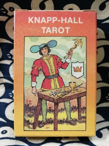
Knapp-Hall Tarot
J. Augustus Knapp and Manly P. Hall, 1929

This deck is one of the early ‘modern’ Tarots. It was originally published by the artist J.Augustus Knapp in 1929, and known then as the Knapp Tarot. This was one year after the first copies of Manly P. Hall’s The Secret Teachings of All Ages had come off the presses, an encyclopedic work for which Knapp had completed 54 elaborate paintings. It is widely assumed that Hall directed this deck’s design, but nowhere is it stated that his contribution extended beyond the meditation crest designs. It is Knapp’s name alone, in fact, which appears on the copyright of the first edition, which can be seen in Kaplan’s Encyclopedia of Tarot I, p198. Hall’s actual influence was probably indirect.


Manly Palmer Hall later established the Philosophical Research Society in 1934. This was the same year that the Knapp deck was reissued in a second edition – this time by copyright of the Philosophical Research Society (PRS), and under the name The Knapp-Hall Tarot. In 1985, U.S.Games gained permission to publish the deck under a license from PRS; the cards shown here are from that later edition.

When Knapp designed these images, there were very few ‘occult’ Tarot decks in existence. The short list of these would be the designs by De Gauita-Wirth in 1889, Falconnier-Wegener in 1896, Papus-Goulinat in 1909, and Waite-Smith in 1910. There were also the earlier decks by Etteilla and the drawings by Court de Gébelin. None of the other occultist decks – such as those by Case, Zain, or Crowley – had yet appeared. This context highlights the deck’s important place in Tarot’s early occult tradition.

This deck combines the symbolism from several of these sources without trying to assert its own idiosyncratic tradition, which many of its occult contemporary decks were trying to do. This is reflected in a passage from Hall’s The Tarot, published 1978:

One such popular set of Tarots has departed so far from the original deck that it is almost unrecognizable. If these cards are analyzed for the merit of their drawings, much can be said in their defense. The artist was a good craftsman, with a lively imagination, but the quaintness and the authenticity of the originals are hopelessly lost. Many people have wasted valuable time working out symbolisms that never existed except in the fertile imagination of the modern card designer.

We can see the influences of the pseudo-Egyptian tradition in this deck. The blind Fool was emphasized in the Etteilla decks, which showed Folly as a jester with his hands over his eyes. This concept was later popularized by Paul Christian, whose Trump descriptions in his 1870 work The History and Practice of Magic promulgated the Egyptian lineage of decks. Another clear ‘Egyptian’ influence is the crocodile, which first appears in Christian’s text and then in the designs of Wirth and Wegener. The simultaneous presence of dog and crocodile may be an homage to the two traditions: Marseilles and Egyptian. The Fool holds his knapsack over his opposite shoulder, a Marseilles element also used by Wirth.


We can again see the Marseilles and Wirth influence in the stance of The Magician and the position of his table. The impact that Wirth had on Knapp is not surprising, since one of his illustrations for Hall’s book had been an entire set of Trumps based upon the Wirth designs. This painting of the ‘Wirth-Knapp’ Trumps can be seen in Hall’s compendium. The explicit gesture of the magician’s finger pointing to earth is previously seen only in the Wegener and the later Coleman-Smith designs. As in other cards, we see in The Magician the combination of the Marseilles and Egyptian patterns. The caduceus wand is a nice innovation not appearing on previous versions of The Magician.

Each of the cards in this deck, with the exception of the Fool, includes a symbolic crest which has purposely been left unexplained by Hall. His mention of them in the introduction from the booklet for the 1985 edition includes this intriguing passage:

With these thoughts in mind, certain designs which invite meditation have been incorporated into the Knapp-Hall Tarot deck. Each person must release some part of his inner consciousness in the interpretation. None of the special devices added has a single unchangeable explanation. To give a list of meanings would be to frustrate the entire purpose of their entire symbolism. It will be noted that the symbols, which are to be experienced rather than interpreted, are of five different types, determined by the backgrounds upon which they are placed.

(1) Those on the major trumps are emblazoned on shields such as appear in heraldry. This tells a story, for it can be asked “What does a shield mean to me, and what characteristics or qualities can protect me?”

(2) In the suit of swords, the added emblems have no borders, but are all based upon the Egyptian crux ansata, the key of life, which gradually merges with the caduceus.

(3) The suit of cups places the significant symbols in a visica piscis, an aura often associated with the Virgin Mary, and in the East with Quan Yin, the Lady of Mercy.

(4) In the suit of batons, the meditation symbols are all placed in triangles and, on the ace, an additional device is present which provides an aid in interpretation of all of the designs.

(5) In the suit of coins or pentacles, all the symbols are within squares and include the symbols of the planets. It would thus be proper to inquire why the planets are associated with the emblems of coinage.

The Arthurian Grail legend seems to have influenced the court cards of the deck. One source that was popular at the time was Jesse Weston’s 1920 study titled From Ritual to Romance, which analyzed the parallels between the Arthurian and Tarot archetypes. These connections had been developed even earlier in Waite’s 1909 book The Hidden Church of the Holy Graal: Its Legends and Symbolism. These studies examined the Trumps in light of the Arthurian episodes, and the suits as possible symbols of the Grail Hallows: the Wand or lance which pierced Christ’s side, the Sword as Excalibur; the Coin as the stone, or as the platter of the last supper; and the Cup as the Grail itself, from which Christ drank. We can see from Hall’s writings that he was impressed by these mystical legends.

Aside from the Arthurian costumes, however, these court cards are actually based upon the designs of the ‘Egyptian’ pattern, which appears for the first time in a 1901 book titled Practical Astrology. These line drawings were made into a deck by U.S.Games called Egyptian Tarot Deck.

The King (shown in middle row) and Queen of Cups each hold a red goblet filled with flaming, steaming liquid. One explanation is that the liquid is blood, perhaps the blood of Christ which the Grail was said to carry. The King points mysteriously towards the ground, or perhaps to the plant at his feet. The new names for the Page and Knight in this deck are also those of the Egyptian pattern: Slaves and Warriors. The Slave of the Cup (above), whose hands are bound, stands by a broken tree while covering his chalice. The Page covering the Cup is seen in some of the Etteilla designs but was later integrated into the Egyptian. Many of the other court cards have similar kinds of enigmatic details.

Again, most of these specifics – flaming cup, King pointing to ground, and even most of the pip arrangements – are originally found in the Egyptian pattern. No explanation for these details was given by the author of Practical Astrology nor by any other author, as far as I know. Considering that the designs purported to be Egyptian, it seems unlikely that these details refer to Arthurian legends. Perhaps the details which Hall or Knapp added into this deck, such as the manacles on the The Slave of the Cup and the broken tree behind him, were meant to accommodate the Egyptian pattern to specific Grail legends.

This deck is becoming scarce, which is true of most of the good decks printed in the 1980’s. One quirk to the deck which I find charming is the grainy quality of the pictures. The images show a halftone pattern which is characteristic of color printing in the early 20th century. The effect reminds me of reading Prince Valiant in the Sunday comics.


Review by Mark Filipas, 10/6/00

Images Copyright © 1985 Philosophical Research Society, Review Copyright © 2000 Mark Filipas